A Skeptical Look at those singing “Happy Days are Here Again.”
Realtors® far and wide are singing “Happy Days are Here Again.” I’m not. Increased demand and limited supply is not good for my clients, the buyers. So my song is “Ain’t Nothin’ Gonna Break my Stride” (Ain’t nothin’ gonna to break my stride. Nobody’s gonna slow me down, oh-no. I got to keep on movin’ Ain’t nothin’ gonna break my stride. I’m running and I won’t touch ground. Oh-no, I got to keep on movin’…)
My very favorite valuation system, FNC has confirmed the trend that is causing all the singing. I trust FNC, because their data includes information about house improvements (or lack thereof.) Here around Boston, where house condition is a key factor in valuation, FNC gives me the best information.
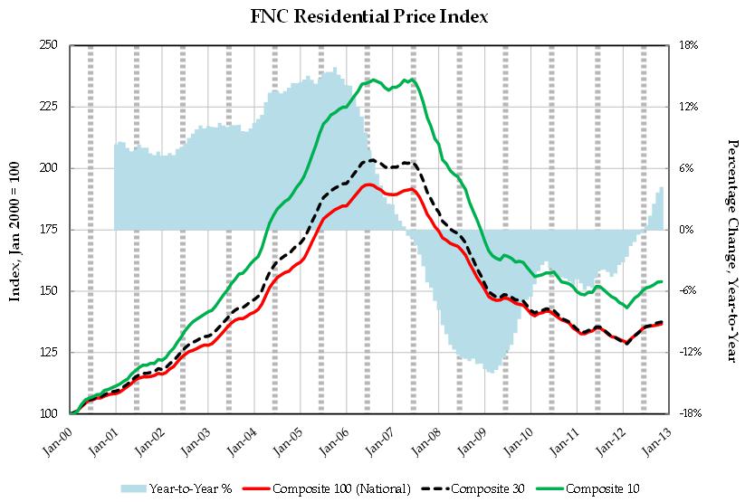
The latest FNC Residential Price Index™ (RPI) shows that the recovery of U.S. property values has continued through November—the ninth consecutive month of price gains driven largely by rising homes sales and moderate economic growth. This is consistent with the chorus of economists and Realtors® singing “Happy Days are Here Again.”
The thing I like about FNC is that it is also remarking on the “why.” As in “why are we seeing a recovery in prices?” They report:
“An imbalance between rising demand and limited supply continues to be an important factor for sustained price momentum. While signs of market recovery have instilled confidence and driven up demand as potential homebuyers take advantage of low prices, the supply of homes for sale has been constrained due to rising homeowners’ expectations about a continued price increase in many fast-rising markets.”
The national survey numbers are here on their chart. Notice the bubble lines on the three levels of composite indexes that FNC creates. They are pretty pronounced. The songs of joy are because of the little tail of blue above the zero shaded blue year-over-year data.
Now for a little fun with numbers. Go to the FNC data page On the Filter bar, choose “All Northeast Region MSAs” Date range: January 2000 to January 2013. Then hit the green “Compare” button on the right.
First look at Boston Metropolitan Statistical Area (MSA) compared to all the Composite Indexes above. Boston looks much less like the hump of a camel. The Boston bubble was edgier. In places without winter and places without such a huge concentration of college-affiliated employment, the seasonality is not as big a factor. So, when a composite is created, the edges wear down. The shape of the Boston area curve – going up from 2000-2006 — has been described as an “inverted S curve.” The prices were highest in the spring market and again in the fall market. Since we hit the top, in 2005 and again in 2006, the curve has gotten more chaotic. So has my life as a Buyer’s agent. (“Ain’t nothin’ gonna break my stride…”)
The Northeast data is limited to New York and Boston. Look at Boston MSA compared to New York MSA. Boston rose faster, but not as high. Boston hit bottom sooner and has been bouncing along the bottom for the past three years. New York hit bottom in 2011, a full two years later. You can tell that these guys are from the South, since they are claiming Washington DC and Baltimore in the Southern region. Add them in and take a look. You’ll see that Boston had a pretty mild bubble compared to Northeast and Mid-Atlantic cities in this Index.
The Mid-West region had no profound bubble, except for Minneapolis. In the South, the bubble was muted in Atlanta, the Texas cities, Nashville, and Charlotte. In the West, Denver didn’t have much bubble at all. California went nuts; quite the camel hump. Southwest cities went up, and then fell much harder, due to overbuilding.
What does this tell me? That this will be a year of high demand. A year when buyers and their agents will need to be at the top of their game to get offers accepted with reasonable terms. (“Ain’t nothin’ gonna break my stride…”)
Leave A Comment