There is a lot of real estate data coming out now. Now that the spring house-hunting season is passed us, the data on those closed sales are available.
The first set of data is courtesy of the National Association of Realtors. Notice that, across the board, their data shows whopping double-digit increases this year. This article explains the methodology on the chart below. All the statistics tell a similar story. This is the information that NAR wants you to see. Their mission is to support home ownership.
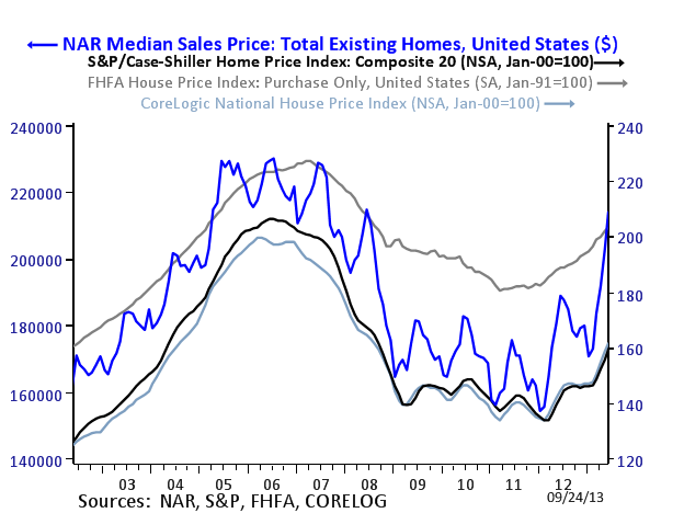 Yet, for 4 Buyers Real Estate and our clients, this data doesn’t tell the whole story. Anyone trying to buy is facing high demand and low supply in the towns we work in.* Nationally, the sales prices have not returned to peak levels, but are up significantly. That’s all true. In some of our market area, there are even houses that are selling above the price they would have fetched in 2006. Others are still well below peak price. One thing is for sure, they are all higher than they were last year.
The factors that have not been discussed in the NAR article is that the cities and regions that showed the highest gains this year were also the cities and regions that showed deepest losses in the bubble-break. Prices in Las Vegas flew up 27.5%, but prices in New York City are up a mere 3.5%. Why? Because New York City didn’t crash all that hard. Las Vegas, on the other hand fell hard; I remember seeing figures of 48% equity loss there.
The second set of data I looked at is from FNC. As part of their methodology, they use data from municipal records to find improvements to properties that have sold. This solves some of the false rise in prices that comes from renovated properties selling for much more than they were worth before the renovation. It accounts for the renovation costs as contributing to the increased value of the property. With armies of flippers out trolling for quick gains, this difference is significant. It gives me a little hope, as a buyer’s agent, that our clients are buying better properties for their additional money.
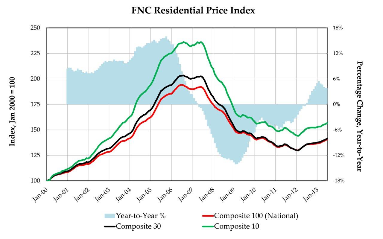
Note what their chart shows:
Looking at FNC’s latest report, the price rises are much more modest, across the board. But, prices are still up. Their headline states a 7% rise, but their narrative states that 4-5% is more typical, nationally. But, wait! When I look at the Boston area statistic, the increase is a paltry 2.2%. So, how do I explain the pain our clients are having? We are in the worst seller’s market since 1999 in the towns I work in.
 First, this is a composite index of the Boston area, which goes a long way from the city. Not all the towns and cities in the region are enjoying (from the seller’s point of view) a recovery. Once a buyer steps out of the “hot zones,” real estate sales are a lot slower and saner (from the buyer’s point of view.) The Boston figure is an average that includes areas where distressed properties are still being sold off.
The areas that are experiencing a seller’s market (where demand is high and supply is low) are areas where well-moneyed people are competing with one another. These areas are selling very high for renovated properties and selling strongly to developers for unrenovated ones. In areas of lower demand, there are slower sales, fewer developers, generally lower prices. To create that composite index, the areas are blended. When the multiple towns in a heterogeneous region are blended for a composite index, it doesn’t tell a local-enough story. Thus, buyers are frustrated and the statistics don’t explain it well.
*our towns: Acton, Arlington, Bedford, Belmont, Brookline, Cambridge, Concord, Lexington, Medford, Melrose, Natick, Needham, Newton, Somerville, Sudbury, Waltham, Watertown, Wayland, Wellesley, and Winchester, MA.
Leave A Comment